
Black Austrians design antiracist logo for a Vorarlberger brewery
- simon INOU is a journalist. He studied Sociology in Cameroon and Journalism at the main University of Vienna, in Austria. From 1992 to 1995 he was co-founder and editor of “Le Messager des Jeunes”, Cameroon´s first youth newspaper. Between 1999 and 2005 he was Chief Editor of Radio Afrika International and of “Informationsportal Afrikanet”. Later Mr. Inou became the project director of BLACKAUSTRIA (blackaustria.at) and took part in the campaign against prejudice towards black people living in Austria. Later BLACKAUSTRIA was also introduced in Germany, Switzerland and the U.S.
- He has initiated numerous Public Awarenes Campaign against Anti-Black Racism and Discrimination in Austria such as Mein Julius (www.meinjulius.at), BlackAustria (www.blackaustria.at),
- Mr. INOU is currently the CEO of M-MEDIA the Diversity Mediawatch Austria, an association aimed at promoting interculturality in Austrian Mainstream Media and which is also responsible for the weekly section on integration/Inclusion of Migrants in the newspaper “Die Presse” (http://www.diepresse.com/integration).
- Serigne Mor NIANG, known as Mara was born on 1972 in Thiès, Senegal. He lives and works between Switzerland, Senegal and Austria. Graduated from the Art School “Ecole des Beaux Arts” of Dakar, He was trained at the University of Art and Industrial Design of Linz, Austria. He also holds a Master degree in Digital Fine Art Academy of “Académie des Beaux-arts” of Vienna. From video to design, Mara’s works are exhibited in Africa and the rest of the world including the Biennale Dak'art 2006 Tanners Workshop in Brussels and VCOE Exnergasse WUK Kunsthalle in Vienna, Den Hvide Kødby / White Meat City in Copenhagen, Denmark. Mara was awarded the Prize of the President of the Republic of Senegal for the logos of the Senegalese Government. Polyvalent artist and famous designer, Serigne Mor Niang is distinguished by his thirst for knowledge. In his work, one can feel the touch of the intellectual quest of knowledge. In the fashion as in the video, he remains a committed artist, not devoid of civic sense and critical. His work is poetry of existence. It reflects the emotions and feeling of human being. The reality of everyday life is his main inspirational source.


19.11.2012 | 11:02 | REDAKTION
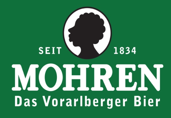
The journalist simon INOU and the artist Mara Niang have developed an alternative logo for the Vorarlberg Mohrenbräu brewery.
Enormous rubbery lips also called dinghy lips, frizzy hair, apelike features, prominent nose. These are the stereotypical characteristics of Blacks, which are being spread in Vorarlberg in public every single day.
For 83 years M*bräu (m*brew) brewery has held Vorarlbergers hostage concerning the spread of racism. The well-known logo of this company is not only found on beer bottles, but also on different merchandising products such as T-shirts or jackets, bottle openers, ashtrays, MP3 players, umbrellas, backpacks, beer mugs, model cars, trucks, jam jars, flower vases, and many more.
For decades the M*Bräu logo has been so naturally and widely spread that many Austrians, in particular Vorarlbergers, are not taking notice of the racist stereotyping. The logo appears as a normal tradition and, on top of that, has even enjoyed positive associations. It has even already been internalised by some Black people.
The German scholar of English and African Studies with a focus on literature, Susan Arndt, says that „M.“ is the oldest German term, with which whites have constructed Black people as being different. The term was translated from other European contexts, and goes back etymologically to the Greek „moros“ which means „foolish“, „simpleminded“, „stupid“ and also „ungodly“.
Various organisations and anti-racism activists have been trying to get in contact with the company in order to encourage them to replace the logo and to discuss the name of the beer and suggest giving it another meaning. To no avail, although the company has modified the logo several times since 1930 in an attempt to represent a modern image to the public.
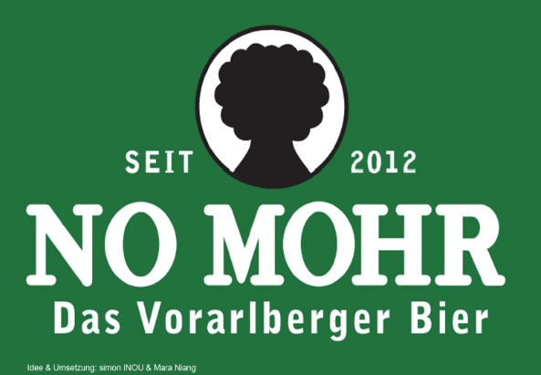
The journalist simon INOU and the artist Mara Niang have designed a new logo for M*bräu transforming both the name of the beer as well as the logo. „We want to call on the Austrian population to fight against racism in public and to promote respectful interaction with citizens from the entire world who have made Austria their home. We believe that the current name M*Bräu and the corporate logo must be adapted to the conditions of a modern, diverse and tolerant society.“
The design which has been developed by INOU and Niang bears the name „NO MOHR“, (no moor/no more“). The logo depicts a typical African tree called Baobab. The tree is regarded as a symbol for protection, a place to rest and to converse in many African societies. Drinks and oil are made from the fruit and the seeds. That´s a respectful symbol for a country which future lies on the diversity of his population.
—–
Translated from German to English by Mrs. Nicola Frantz-Jobarteh
3 Kommentare
markus
so kann man sich auch lächerlich machen Geschrieben um 20. November 2012 um 20:26 UhrMatthias
So ein Stuss, habt ihr keine echten Probleme? Wir könnten ja einfach die Bundeshymne verweiblichen - ach, schade ... hatten wir ja schon. Wie wärs mit Ändern der Rechtschreibung? Auch schon zu spät ... irgendwas muss uns doch einfallen! Geschrieben um 20. November 2012 um 16:46 UhrElmar Maier
Habt ihr keine anderen Sorgen?? Seid ihrt blind für das was auf der Welt an Gewalt und Unrecht geschieht? Wenn ihr noch selbst den 2. Weltkrieg erlebt hättet, würdet ihr euch schämen.Die Erfinder dieses Blödsinns sind sicher keine Schwarzen,die sich beleidigt fühlen,sondern Leute, die entweder zu dumm oder zu faul zum Areiten sind! Gute Besserung! Ing.E.Maier (85 Jahre alt) Geschrieben um 20. November 2012 um 10:09 Uhr
Kommentieren Sie den Artikel
Weitere Artikel von REDAKTION
- Neue Deutsche Medienmacher: Herkunft und Religionszugehörigkeit haben in Kriminalberichtserstattung nichts verloren
- Verband Österreichischer Zeitungen unterstützt Diversity Media Week
- Filmabend: Kritischer Film über Kronen Zeitung wird debattiert
- Solidarischer Hilferuf für Hochwasser in Serbien und Bosnien-Herzegovina
- „The World War one in Africa project“ by Jacques Enaudeau and Kathleen Bomani